Brand Identity
Branding Guidelines
Brand Pillars
About
I help people who are ready to stop living on autopilot design a life they actually chose; through original frameworks, long-form writing, and creative work built from decades of real experience.
For individuals: the Imagineer Framework, the Project Lifescape organization & the content, community, and tools that come with it; all designed to move you from default to intentional.
For organizations: multi-disciplinary capability across brand design, web development, data analysis, visual storytelling, content strategy, speaking engagements for corporate events, and systems design; all delivered by someone who has operated in high-stakes environments and built from scratch.
From Default to Design
Baltimore gave me a lot of things. A tough skin. A short fuse. And a very clear picture of where I was headed if I didn't change something.
I was born March 31, 1985. Raised by a single mother who did everything she could with what she had. I was not a good student. Not an easy kid. I got expelled from grade school. Then high school. The system didn't know what to do with me and honestly, I didn't know what to do with myself either.
Job Corps was the first place that gave me a direction. I was studying Electrical Wiring; vocational, practical, real. But completing the program required employment. I needed a job. Fast.
Service was the fastest answer. It was also a way out; out of Baltimore, out of the environment I'd grown up in, out of the version of me that was slowly forming there.
I enlisted.
They taught me discipline. They did not teach me how to be a man.
I had my first son while I was still in uniform. I could not be the father he needed. That weight doesn't just sit on you; it becomes part of you.
A deployment did something else to me. Something I didn't have a name for when I came home. I know what it was now, PTSD. Back then it was just pressure I couldn't explain and couldn't escape. So, I didn't deal with it. I managed it the wrong way. Carried it in silence for fourteen years; self-medicating, staying in motion, never stopping long enough to actually look at it.
When I left the service, I had the baggage and none of the tools.
I got into trouble. Started moving in a direction I recognized was wrong and kept moving anyway. Baltimore had a way of pulling you back into the current if you let it.
So, I left.
Late 2005. I caught the Greyhound to Florida with not much more than the intention to start over. Took every job I could find; working jobs nobody brags about, putting my electrical training to use wherever I could, learning things nobody planned to teach me.
In 2008 I had my second son.
The questions I'd been half-asking got sharper. I couldn't keep floating. I started getting serious about figuring out what it actually meant to be a man, the real version, not the one I'd been performing. I sought psychiatric help. Started reading. Studying frameworks. Testing ideas against my own life. The self-medication never fully went away but for the first time I was dealing with the source, not just quieting the signal.
By 2012 I was working inside VA medical centers, serving veterans while still quietly carrying my own damage. The irony of that was not lost on me.
In 2015 I left Florida and moved to Georgia. That's when I picked up a camera. Videography became something real, a way to tell a story, at a time when I was still learning how to tell my own.
Then in 2016 I had my third son.
That was the actual beginning.
My second son had made me want to be better. My third son made me understand that better wasn't enough, that what I was building needed to be bigger than me. The concepts I'd been developing, the frameworks I'd been living, the lessons accumulated through all of it, they couldn't just sit in a manuscript. They needed a structure. A system. Something that could reach further than I could reach alone.
I didn't have a name for it yet. But what would become Project Lifescape was born in that room, even before I knew what to call it.
I kept doing the work. Seeking help. Reading. Writing. Growing, imperfectly and honestly, without pretending the journey was clean or the path was straight.
January 2021, I sat down and started writing the manuscript in earnest. Five years later, 48 chapters in, I'm not just writing about the system anymore. I'm building it.
That became the foundation of Project Lifescape.
Not a concept. An obligation. A system built from everything I went through, for people who are ready to stop living by default and start designing something they actually chose.
Voice & Tone
Brand Essence
Igniting transformation through imagination, discipline, and design.
Brand Promise
Devin Marshall delivers frameworks, content, and creative work that empower people to move from living by default to living by design — combining intellectual depth with straight-talking clarity and visual craftsmanship.
Positioning
For individuals seeking purpose, collaborators seeking vision, and employers seeking multi-disciplinary excellence, Devin Marshall is the Imagineer-Mentor who uniquely combines military discipline, creative artistry, analytical rigor, and a proprietary framework for intentional living — delivered through bold, fire-and-steel authenticity that no one else in the personal development space can replicate.
Voice
Speak with the clarity of a mentor, the directness of a soldier, and the depth of someone who has actually done the work.
Tone Variations
| Context | Tone | Example |
|---|---|---|
| Teaching / Content | Mentor | Here's what most people get wrong about intentional living — and how to fix it. |
| Professional / Portfolio | Authority | I build systems that transform how people design their lives. |
| Personal / Social | Authentic | Some days the gap between vision and reality is humbling. That's the work. |
| Thought leadership / Blog | Reflective, intellectual, purposeful | The Imagineer Framework exists because I needed a way to see my own life clearly before I could redesign it. |
| Bio / About page | Confident, direct, human | Army veteran. Founder. Imagineer. I build frameworks that help people design lives worth living. |
| Project case studies | Clear, structured, visionary | The problem was fragmentation. The solution was orchestration. |
| Creative portfolio | Expressive, imaginative, bold | Minimal text: let the work speak. Captions are poetic, not explanatory. |
| Social / casual | Approachable, real, mentoring | Here's what most people get wrong about purpose… |
| Technical documentation | Precise, efficient, structured | The Imagineer Framework applies nine lenses: Structure, Function, Properties, Processes, Evaluation, Definitions, Classification, History, Personalities. |
| Fundraising / community | Warm, urgent, purposeful | This isn't charity. It's infrastructure. Your contribution builds the platform that builds lives. |
Colors
Primary
Flame Red
#D33D3C#E05555Logo primary color (flame element). Imagineer pillar accent. Headlines and hero text (sparingly, for impact). Primary call-to-action buttons. Hover and active states. Accent elements (dividers, icons, highlights). Pull quotes and emphasis.
✓ **Passion & Energy** - Captures the fire in the logo and the brand story. ✓ **Courage & Action** - Aligns with military service, bold life decisions, entrepreneurship. ✓ **Urgency & Importance** - Communicates that intentional living can't wait. ✓ **Leadership & Authority** - Red is historically the color of commanders and movements. ✓ **Transformation** - Fire destroys the old to make way for the new. ✗ Not calming or passive - deliberately so; this is a catalyst brand
Secondary
Steel Gray
#AFAEAE#C8C7C7Logo secondary color (ring and dimensional shadow), subheadings and secondary text where appropriate, borders/dividers, icon fills (secondary/inactive states), card borders.
✓ **Balance & Neutrality** - The calm center between extremes. ✓ **Professionalism & Sophistication** - Corporate-grade polish without coldness. ✓ **Resilience & Strength** - Steel, armor, infrastructure - things that endure. ✓ **Discipline & Composure** - The military bearing, the steady hand. ✓ **Timelessness** - Gray never dates, never trends, never fades
Neutrals
Near Black
#1A1A1A#EDEDEDDisplay headings, hero text, high-impact moments. 14.5:1 on Off-White.
Authority and gravitas without the harshness of absolute black. The visual weight of a commanding presence. Military dress uniform energy: controlled, intentional, earned. Not harsh, not cold, present.
Deep Charcoal
#2D2D2D#E8E8E8Primary body text. 11.3:1 on Off-White.
The color of the written word throughout history. Softer than black to reduce eye strain during extended reading, yet dark enough to carry full authority. Substance that doesn't perform.
Off-White
#F5F5F5#111111Primary background. Canvas. Open, clear, breathing room.
Slightly warmer than clinical white; a canvas that invites lingering. Creates breathing room and reduces eye fatigue in extended reading sessions. The page as open space; potential, not void.
White
#FFFFFF#2D2D2DCards and elevated surfaces — visually "lifts" above #F5F5F5.
Elevation and priority. Used only for raised surfaces (cards, modals) set against the off-white background; a single step of luminance that signals "this content is foregrounded."
Smoke
#6B6B6B#AFAEAECaptions, metadata, timestamps, helper text. 5.9:1 on Off-White.
Recessive by design. A mid-gray that pulls visual focus away from itself, directing attention toward primary content. Says "this is secondary information" without apology or noise.
Ash Gray
#D4D4D4#3A3A3ADisabled buttons, inactive form fields, placeholder borders.
The visual language of inactivity and boundary. Light enough to register, muted enough to communicate "not yet" or "unavailable." A closed door that is clear without being dismissive.
Warm Neutrals — Editorial Palette
Parchment
#FAF4E6Reading pages, blog, journal, warm-mode hero backgrounds
The feeling of a well-worn notebook. Warm, inviting, slightly aged — communicates that ideas have lived here. Reduces harsh white fatigue during extended reading.
Warm Stone
#E8DDD0Warm card backgrounds, elevated surface in editorial layouts
Sun-warmed concrete and natural clay. Approachable solidity. Grounded without being heavy.
Sand
#C8B89ABorders, dividers, secondary UI elements in warm-mode contexts
Desert patient. A mid-tone that neither advances nor recedes — it simply holds space, warm and steady.
Driftwood
#9A8572Secondary/caption text on Parchment or Warm Stone backgrounds
Wood worn smooth by time and water. Secondary information that feels considered and present, not afterthought gray.
Cocoa
#2A201AHeadings and body text on Parchment backgrounds
Rich, warm depth. The warmth of dark roast, worn leather, the inside cover of a book. Authority without the harshness of near-black.
Derived Functional Colors
Dark Flame
#A82E2D#E06564Button hover & active states.
Pressure and committed action. The red pushed deeper, used at the precise moment of click or hover to signal commitment. Reinforces decisiveness without aggression.
Ember Wash
#FDF0F0#251919Alert backgrounds, notification banners.
Brand energy at a whisper. Carries the red's presence without its urgency. Awareness without alarm. Fire made quiet.
Dark Steel
#404040#3A3A3ADark mode borders
Structural definition in depth. Architectural boundaries that define where things end without visual weight.
Surface Dark
#242424#2A2A2ADark mode subtle backgrounds
Depth and layered hierarchy. The receded canvas that creates elevation difference between background and surface. Quiet, functional, invisible when working correctly.
Extended Palette — Harmony-Derived
Forge Teal
#3B9B9B#5CBBBBAnalyst pillar accent, data visualization, analytical section backgrounds
Balance, analytical clarity, trust. The calm counterweight to red's fire. Where red ignites, teal reasons.
Ember Amber
#B27334#D4943DBuilder pillar accent, warning states, warm gradient midpoints, achievement badges
Warmth, craft, physical achievement, earned results. The glow of something built. The embers after the flame.
Crimson Rose
#AC3973#C95E8ECreative portfolio section theming
Creativity, artistic passion deepened, aesthetic sensibility. Deep artistic conviction.
Verdant
#3D8F66#56B37FData visualization, growth/progress context indicators
Growth, organic progress, sustainability, forward movement.
Command Blue
#366BA1#5A8EC0Veteran pillar accent, informational status states, professional credentials
Authority, service, trust, institutional credibility. The weight of uniform, rank, and service.
Signal Green
#3A883A#58A858Success/confirmation status states, form confirmation, positive data indicators
Success, confirmation, alive, growth-complete.
Royal Indigo
#3D3D8F#6060B5Storyteller pillar accent, long-form content headers, book/writing section theming
Intellectual depth, narrative gravity, accumulated wisdom. Where red ignites and teal clarifies, indigo reflects.
Harvest
#668F3D#88B35AData visualization, environmental contexts, long-term growth progress charts
Organic growth, sustainability, natural systems. The harvest of disciplined, sustained effort over time.
Signal Violet
#6B4096#9060B8Creator pillar accent, creative/visionary content section theming
Imagination, artistic vision, innovation at the edge of what's possible. The vision before the spark.
Vitality Palette — Full-Spectrum Gap Fills
Coral Pulse
#D96652#D96652Community section theming, testimonials, podcast/media content, social posts
Human-scale warmth and approachable fire. The warm face of the brand — where discipline leans toward conversation.
Solar Gold
#D4A520#E8BC38Achievement badges, milestone markers, featured content callouts, premium tier design
Peak achievement, radiance, illumination. The gold standard made visible — earned recognition and milestone completion.
Sky
#3B94C8#5CB0DCProject Lifescape aspirational sections, vision content headers, life design tools
Expansiveness, open sky, freedom, the aspiration of unbounded possibility. The color of a clear morning before the work begins.
Orchid
#9B4B9E#BB70BECreative process documentation, behind-the-work content, artistic portfolio accent
Creative transformation, artistic alchemy. The convergence of imagination and form — not the finished work, but the making.
Color Harmony Wheel
All 14 palette colors derived from Flame Red at 0° using standard color theory relationships.
| Swatch | Hue | Name | Hex | Relationship | Brand Rationale |
|---|---|---|---|---|---|
| 0° | Flame Red | #D33D3C | Primary | Brand anchor — the ignition point | |
| 12° | Coral Pulse | #D96652 | Gap Fill | Human warmth zone between red and amber | |
| 30° | Ember Amber | #B27334 | Analogous Warm | Craft and building; the embers of sustained effort | |
| 45° | Solar Gold | #D4A520 | Gap Fill | Peak achievement and illumination | |
| 90° | Harvest | #668F3D | Tetradic A | Organic growth, long-term effort made visible | |
| 120° | Signal Green | #3A883A | Triadic A | Success, confirmation, and completion states | |
| 150° | Verdant | #3D8F66 | Split-Comp A | Organic progress and natural forward movement | |
| 180° | Forge Teal | #3B9B9B | Complementary | Maximum contrast; analytical clarity opposite red | |
| 203° | Sky | #3B94C8 | Gap Fill | Open sky, aspiration, and expansive possibility | |
| 210° | Command Blue | #366BA1 | Split-Comp B | Authority, service, and earned institutional trust | |
| 240° | Royal Indigo | #3D3D8F | Triadic B | Narrative depth, intellectual gravity, accumulated wisdom | |
| 270° | Signal Violet | #6B4096 | Tetradic B | Imagination; the vision before the spark | |
| 298° | Orchid | #9B4B9E | Gap Fill | Creative transformation — where vision becomes form | |
| 330° | Crimson Rose | #AC3973 | Analogous Cool | Deep artistic conviction and expressive passion |
Tint & Shade Scales
5-step scales (50 → 100 → 500 → 700 → 900) for key extended and vitality colors.
Forge Teal
50
#EEF9F9
100
#C4E8E8
500
#3B9B9B
700
#276B6B
900
#153A3A
Ember Amber
50
#FDF5EB
100
#F2D9B5
500
#B27334
700
#7A5024
900
#3D2810
Command Blue
50
#EEF3FB
100
#BAD0EA
500
#366BA1
700
#244A70
900
#122538
Signal Green
50
#EEF7EE
100
#B8D9B8
500
#3A883A
700
#285E28
900
#143014
Signal Violet
50
#F3EEF9
100
#CEB8E8
500
#6B4096
700
#4A2C68
900
#261633
Solar Gold
50
#FBF6E6
100
#F0D98A
500
#D4A520
700
#907016
900
#48380A
Sky
50
#EEF6FB
100
#BAD9F0
500
#3B94C8
700
#28668C
900
#143344
Gradient Definitions
Named gradients available as CSS custom properties.
Hero — The Ignition
--gradient-heroFull-bleed hero backgrounds. Flame to near-black.
Fire to Ember
--gradient-fire-emberHorizontal accent bars and progress fills.
Sunrise — Warm Ascent
--gradient-sunriseAchievement heroes and milestone moments.
Aurora — Cool Spectrum
--gradient-auroraCreative and visionary hero sections.
Horizon — Journey Sweep
--gradient-horizonHorizontal progress bars showing a journey.
Parchment Depth
--gradient-parchmentLong-form reading page backgrounds.
Teal Wash
--gradient-teal-washAnalytical section background overlays.
Indigo Depth
--gradient-indigo-depthStoryteller section and dark hero overlays.
Typography
Montserrat
The quick brown fox jumps over the lazy dog.
Specimen
AaBbCcDdEeFfGgHhIiJjKkLlMmNnOoPpQqRrSsTtUuVvWwXxYyZz
0123456789 !@#$%&*()
Weights: 600, 700, 800
Use: Display / Hero
Commanding geometric sans-serif. Architectural. Modern. Built for impact at large sizes.
Geist Sans
The quick brown fox jumps over the lazy dog.
Specimen
AaBbCcDdEeFfGgHhIiJjKkLlMmNnOoPpQqRrSsTtUuVvWwXxYyZz
0123456789 !@#$%&*()
Weights: 400, 500, 600, 700
Use: Headings / Body
Humanist sans-serif. Readable, warm, intelligent. Scales from h1 to body copy.
| Level | Size | Weight | Line Height | Tracking |
|---|---|---|---|---|
| H1 — Display | 40px / 2.5rem | 700 | 1.1 | -0.02em |
| H2 — Heading | 32px / 2rem | 600 | 1.2 | -0.01em |
| H3 — Subheading | 24px / 1.5rem | 600 | 1.3 | 0 |
| Body | 16px / 1rem | 400 | 1.7 | 0 |
| Caption | 12px / 0.75rem | 400 | 1.5 | 0.01em |
Visual Assets
Primary Logo

Submark / Icon

Photography Style
Portraiture
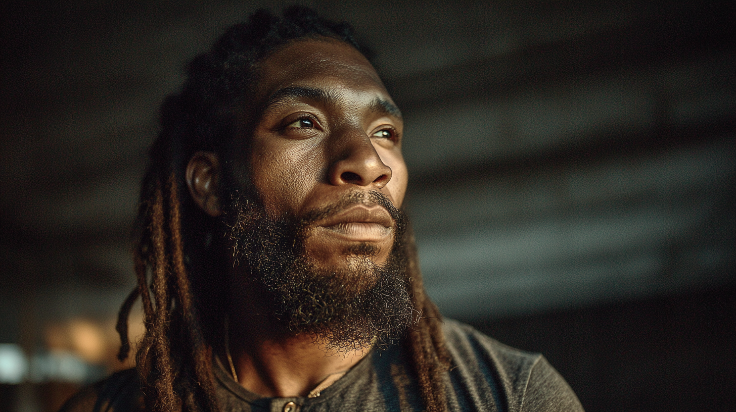
Formal portraits serve a specific purpose in this brand: establishing credibility and presence without sacrificing the authentic, earned aesthetic. They are used in the About page, press kit, speaking bios, and professional profiles.
Lighting Style
- Rembrandt or short lighting — Directional, single-source or two-source with a clear key side. The shadow on the non-key side of the face creates dimensionality and authority. Avoid butterfly/clamshell lighting — it reads as commercial headshot, not personal brand.
- Practical light sources — Window light, studio strobe modified with a large softbox, or practicals (lamps, screens, architectural fixtures) that feel environmental. The light source should feel plausible in the world the subject inhabits.
- Color temperature: Warm key light (3200–4000K) against a neutral or slightly cooler fill or background. This mirrors the brand's warm-subject / neutral-environment contrast strategy.
- Avoid: Ring lights. Flat frontal lighting. Anything that eliminates shadow structure. Overlit backgrounds that produce a white halo around the subject.
Framing
- Preferred frames: Head-and-shoulders (tight), half-body, and environmental three-quarter. Not full-body fashion-style shots.
- Angle: Slightly above eye level or dead-on. Never a sharp upward angle (feels confrontational, distorting) or a far downward angle (feels diminishing).
- Background: Real environments only — a desk with objects, an architectural surface, a wall with texture. Depth-of-field separation is acceptable but the background should remain readable. No blown-out or solid-color seamless.
- Eye contact: Direct eye contact is the default for primary portraits. Off-camera gaze is acceptable for secondary editorial shots used in-context (alongside blog content, etc.) but should not be the face of the brand.
- Negative space: Leave intentional breathing room on one side — portraits should not feel cropped-in or claustrophobic. The composition should feel considered, not grabbed.
Mood
- Tone: Grounded, present, confident. Not stiff. Not performatively relaxed (the "I'm-just-here-casually" lean-against-a-wall pose). The subject looks like someone mid-thought, not someone who was just told to smile.
- Expression: Composed, with a hint of intensity. Slight jaw set, neutral or nearly neutral mouth. The eyes do the work.
- Energy: Commander, not celebrity. The goal is the feeling of someone you would trust with a serious problem, not someone you would follow on Instagram for lifestyle content.
- Wardrobe: Solid colors or minimal patterns. Nothing that competes with the face. No branded apparel in primary portraits. Military bearing in posture — upright, intentional — without wearing the uniform.
Candid / BTS
Candid and BTS photography serves a different function than portraiture or hero imagery: it builds intimacy, demonstrates the reality of the work, and makes the brand feel inhabited rather than produced.
When to Use
- Blog posts and long-form editorial content
- Social media (especially Stories, Reels intros, and carousel context shots)
- The "Now" page and project update content
- Newsletter headers and footer signatures
- Portfolio case studies — show the process, not just the result
Guidelines
- Natural motion is the goal. Photographs taken mid-action — writing, editing, building, filming — outperform any posed shot. The subject should appear unaware of or indifferent to the camera.
- Let the environment tell the story. A notebook covered in handwriting on a rough wooden surface says more than any studio setup. Cables, tools, multiple open windows on a monitor — these details signal real work.
- Imperfection is a feature, not a flaw. Slight motion blur on hands. A slightly off-center frame. A subject partially cut by the edge. These signal authenticity. Do not over-correct in post.
- Lighting: Available light or minimally supplemented. A reflector or a single bounce card is acceptable. A full lighting rig defeats the purpose.
- Color grading: Consistent with the brand's desaturated-environment approach. Mute backgrounds, preserve subject warmth, maintain shadow detail. Do not apply warm-and-moody Instagram filters.
- Series over singles: BTS photography works best in sequences — three to five shots from the same session create a narrative. A single candid in isolation can feel random.
What to Capture
| Subject Matter | Notes |
|---|---|
| Writing / Journaling | Notebooks, handwriting close-ups, manuscript drafts on screen |
| Editing / Analysis | Multiple monitors, data visualizations in progress, code on screen |
| Filming / Videography | Camera setups, monitors displaying live feed, framing a shot |
| Physical work | Electrical tools, hands-on construction or installation environments |
| Reading / Research | Books open, margin notes, research scattered across a surface |
| Conversation / Teaching | Two-person or small-group settings; the subject listening, not performing |
What to Avoid
- Posed "candid" shots where the subject is clearly aware and performing naturalness
- Cluttered or messy backgrounds that read as chaotic rather than lived-in
- Shots where the subject is looking at their phone in a way that reads as distraction, not focus
- Any BTS that contradicts the brand's environments (office cubicles, generic meeting rooms, public coworking spaces that feel anonymous)
Stock
The default position is: do not use stock photography. The brand's authenticity is one of its primary differentiators. Stock imagery — even high-quality editorial stock — signals that real content is not available, which undermines the brand's "earned, specific, documented" visual standard.
When Stock May Be Used
Stock imagery is acceptable only in specific, bounded scenarios:
- Illustrative conceptual content — A blog post explaining a systemic framework (e.g., a piece on habit architecture) may use a single conceptual image where no real photograph exists or is appropriate. The image must be chosen at a higher editorial standard than typical stock selection.
- Placeholder during production — Development and content staging may use stock as a temporary placeholder. All production placeholders must be replaced before publish.
- Data and interface illustrations — Abstract representations of data systems, network diagrams, or interface metaphors where a real screenshot would expose private data or appear unfinished.
Selection Standards (When Stock Is Approved)
If stock is used, it must pass the same rejection criteria as original photography (Section 11 Rejection Criteria), plus:
| Requirement | Standard |
|---|---|
| No recognizable stock aesthetics | Cannot look like it came from a licensing library — no MacBook on white desk, handshake imagery, or diversity-brochure compositions |
| Environmental specificity | Must look like it was taken somewhere real and specific, not a generic "workspace" or "city at night" |
| Color temperature alignment | Must fit the brand's warm-subject / neutral-environment approach |
| No visible brand marks | Remove or avoid images where competing brand logos, products, or marks appear |
| No people unless editorial-quality | Stock people almost always fail the authenticity test. Use people-free conceptual shots, or use real photography. |
Sources (If Approved)
- Preferred: Getty Editorial, Stocksy (editorial license), photographer-direct licensing
- Acceptable with extra scrutiny: Unsplash photographers with editorial/architectural portfolios
- Never: iStock standard library, generic Shutterstock lifestyle, AI-generated "photography"
Graphic Elements
Graphic elements operate alongside photography, not instead of it. They reinforce brand structure, create visual rhythm, and carry meaning at scale — in UI components, print materials, social templates, and section breaks. The rules that govern photography (earned, specific, purposeful) apply equally here.
Design Philosophy
Graphic elements in this brand are structural, not decorative. Every pattern, texture, or icon must earn its presence by performing a function: separating content, adding depth to a flat surface, reinforcing a pillar's visual vocabulary, or improving information hierarchy. Elements that exist purely for visual interest are eliminated.
The aesthetic reference is industrial precision — the same tension as the color palette. Geometric and angular forms over organic curves. Controlled repetition over chaotic variety. Material texture over smooth digital abstraction.
Patterns
| Usage Context | Approved Patterns | Notes |
|---|---|---|
| Section backgrounds | Subtle diagonal line grid, fine dot matrix | Low opacity (4–8%) on dark backgrounds. Never competes with text. |
| Card / tile backgrounds | Fine crosshatch or woven-line grid | Adds depth to flat surface elements. Light mode: near-white on white. Dark mode: near-black on near-black. |
| Dividers / section breaks | Single rule line, double rule with space, or rule + red accent dot | Horizontal rules use border-border-subtle. Red accent dot signals a transition into a new brand pillar section. |
| Social template backgrounds | Diagonal offset grid or diagonal stripe pattern | Used behind quote cards and pillar content. Opacity capped at 10%. |
Pattern rules:
- Patterns are never applied behind primary content — only behind secondary or background zones
- Maximum one pattern type per layout. Mixing two patterned zones creates noise.
- Patterns in print materials: vector only. No raster-upscaled patterns.
- Scale the pattern repeat relative to the viewport — patterns that tile too small read as noise; patterns that tile too large read as intentional geometry (which may be appropriate at large scale, e.g., section divider graphics)
Patterns to avoid:
- Chevrons and herringbone — too fashion-adjacent for this brand
- Halftone dots — reads as retro/pop art, conflicts with the precision aesthetic
- Hexagon patterns — overused in "tech brand" contexts; disqualified by association
- Organic flowing blob shapes — zero geometric language; belongs to an entirely different brand family
Textures
Textures add material weight to flat digital surfaces and anchor the brand's "earned, not produced" aesthetic.
| Texture Type | Use Cases | Application Notes |
|---|---|---|
| Brushed metal / concrete grain | Dark mode background overlays, print collateral | Subtle overlay at 5–15% opacity. Creates depth without distraction. |
| Paper grain / pressed fiber | Light mode surfaces, document-style layouts, print | Fine grain only. Not the rough-paper aesthetic of vintage/artisanal brands. |
| Worn concrete / industrial surface | Large section backgrounds, editorial spreads | Used rarely — reserved for high-impact layout moments where "weight" is intentional. |
| Carbon fiber / woven mesh | Technical content sections (data, systems, engineering pillars) | Applied only where the content itself is technical. Texture reinforces content context. |
Texture rules:
- Textures are blended overlays, never the dominant visual
- All textures must be high-resolution source files (300dpi minimum for print; 2× display density minimum for screen)
- Do not apply texture to text containers or anything requiring WCAG contrast compliance — texture reduces contrast; ensure text floats above texture zones on its own layer
- Avoid textures that look dirty or distressed (cracked concrete, torn paper, rusted metal) — the brand aesthetic is precision-industrial, not weathered
Icon Style
The brand uses Lucide React as its sole icon library for UI and digital contexts.
Lucide React — System Rules:
| Property | Specification |
|---|---|
| Stroke width | 1.5px (Lucide default) — never 1px (too delicate) or 2px (too heavy) |
| Size scale | 16px · 20px · 24px · 32px — align to the 4px grid |
| Color | currentColor (inherits text color) for functional icons; --color-accent (Flame Red) for accent/highlight icons; --foreground-muted for inactive/secondary icons |
| Pillar icons | Use corresponding pillar accent color (Section 5.10) — Imagineer, Builder, Analyst, etc. |
| Filled icons | Never. Lucide is an outline icon system. Filled icons from a different library will not be introduced. |
| Mixing libraries | Never mix Lucide with another icon library in the same interface. |
| Emoji as icons | Never in UI. Emoji belong in social and informal copy only (Section 11 Photography & Iconography). |
Icon sizing context:
16px— Inline with body text, compact metadata (date, read-time, tag indicators)20px— Navigation, compact action buttons, dense UI24px— Standard action icons, section labels, feature callouts32px— Featured/hero icons, pillar section headers, empty state illustrations
Custom icons (if required):
Where Lucide does not provide an appropriate icon (e.g., a brand-specific pillar symbol or a unique concept icon), custom SVG icons may be created under these constraints:
- Match Lucide's stroke weight (1.5px at 24px canvas) exactly
- Geometric and angular construction — no loose curves or organic forms
- Supplied as SVG with
currentColorstroke and no hardcoded fill colors - Reviewed against the Lucide library to confirm no close approximation exists before commissioning
Decorative Elements
Beyond patterns, textures, and icons, a small set of decorative graphic marks are approved for brand use:
| Element | Description | Use Cases |
|---|---|---|
| Flame accent mark | A stylized single-line flame SVG derived from the logo | Pull quote accents, section openers, brand moments where the fire symbol amplifies meaning. Never overused — one per layout maximum. |
| Red rule + dot | A horizontal rule terminating in a Flame Red filled circle | Section dividers, list terminators in print, footer separators in editorial layouts |
| Corner bracket marks | Angular open-corner brackets (not typographic [ ]) |
Framing key statistics, callout numbers, or highlighted data points. Communicates precision, measurement, analytical rigor. |
| Diagonal slash marks | Single or double diagonal lines (45°) | Separating two values in tight layouts (e.g., "Design / Build"), visual motion elements in social templates |
Decorative element rules:
- No more than two decorative element types in a single layout
- Decorative marks are graphic, not typographic — never substitute a glyph (→, /, |) where the brand graphic form is specified
- All decorative SVGs are output as inline SVG or sprite references, never as raster images
- Scale and weight must be proportional to the content they accompany — marks that visually overpower adjacent text are resized or removed
Moodboard

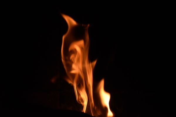
Flame Swirl
overall
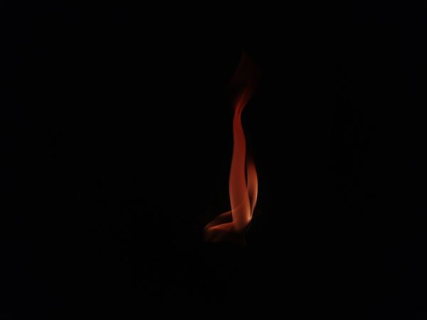
The Solitary Flame
overall
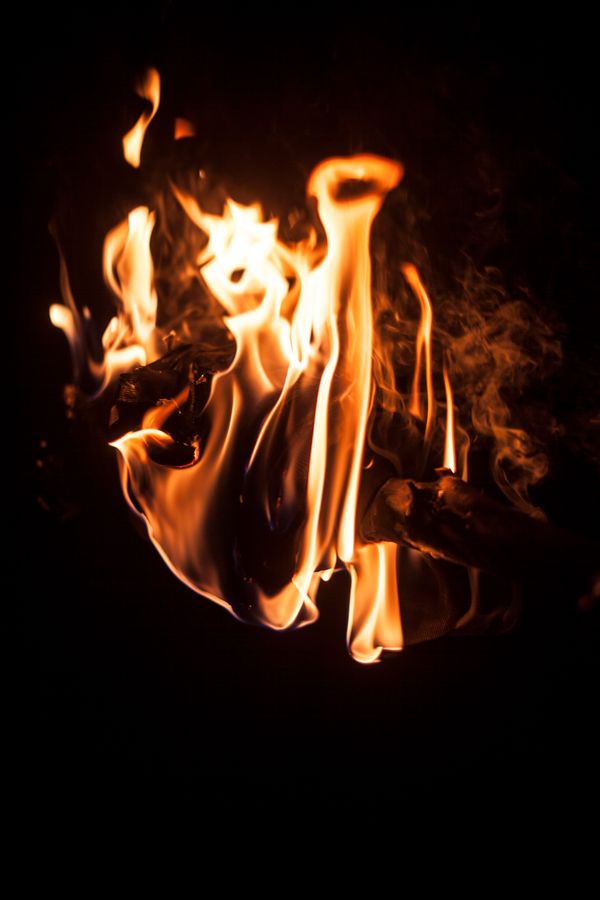
Close-Up Flame
overall

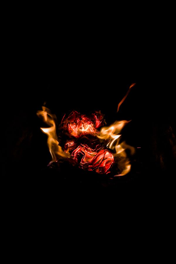
Dancing Flames
overall
Intense Flame
photography
Orange Flame
photography
Flickering Flames
photography

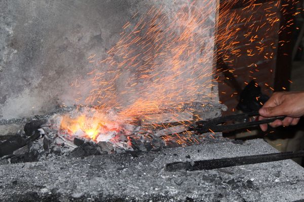
Sparks
photography

Hot Metal
photography
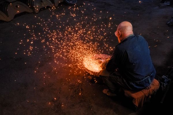
The Blacksmith
photography
Flying Sparks
photography

Hot Hammer
photography
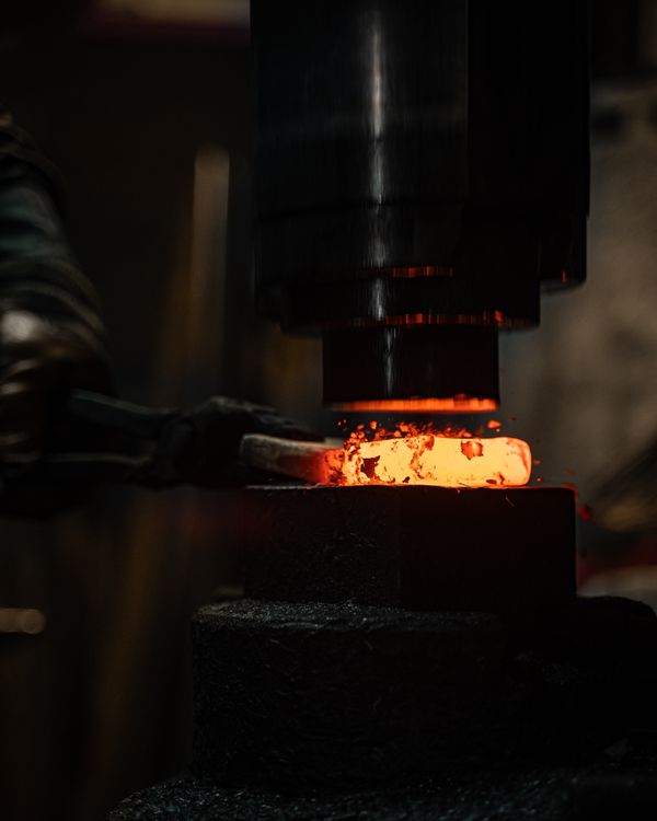
The Forge
photography
Formation
photography
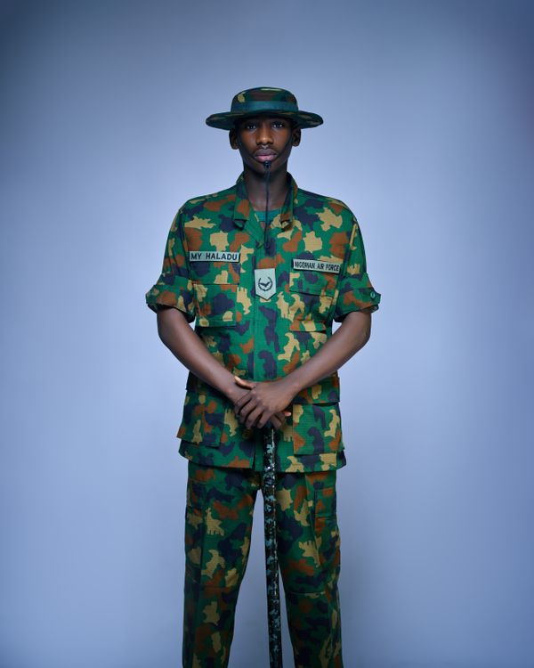
Soldier Portrait
photography
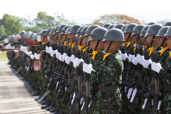
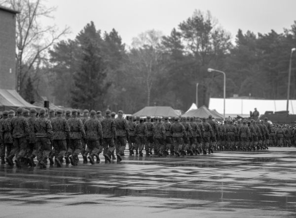
The March
photography

Precision
photography
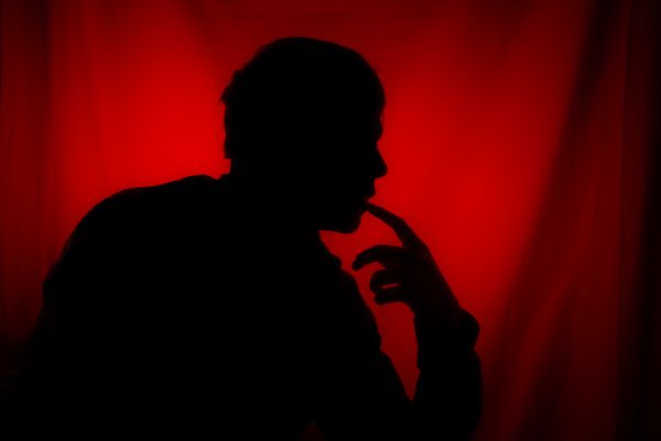
Red Silhouette
photography

Dramatic Red Glow
photography
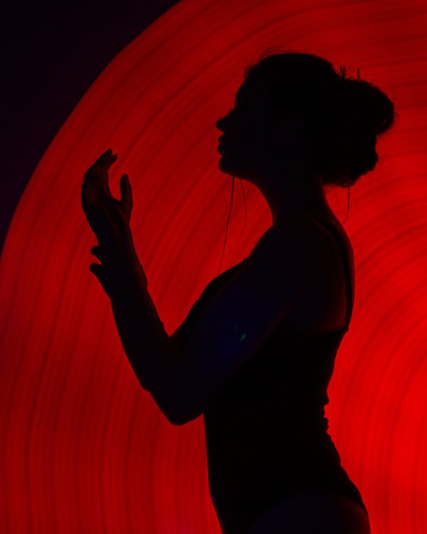
Red Backdrop
photography
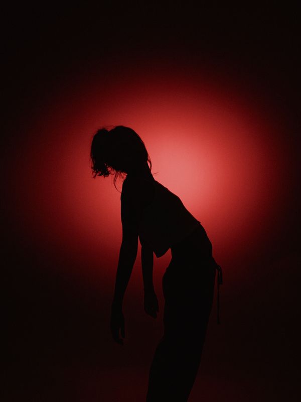
Silhouette
photography
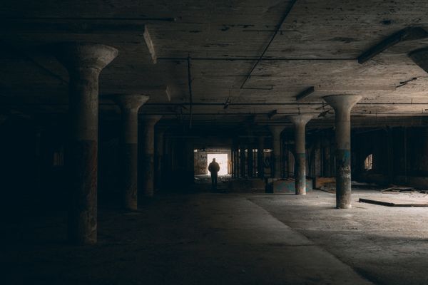
The Tunnel
photography
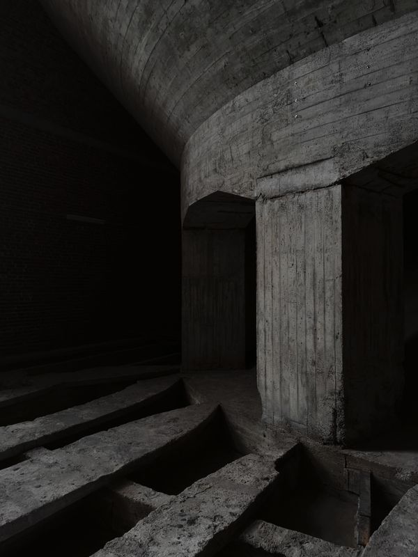
Abandoned Concrete
photography
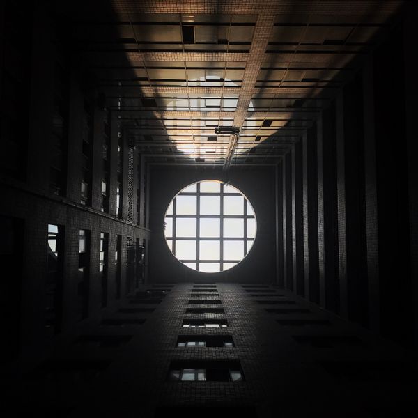
Circle of Light
photography
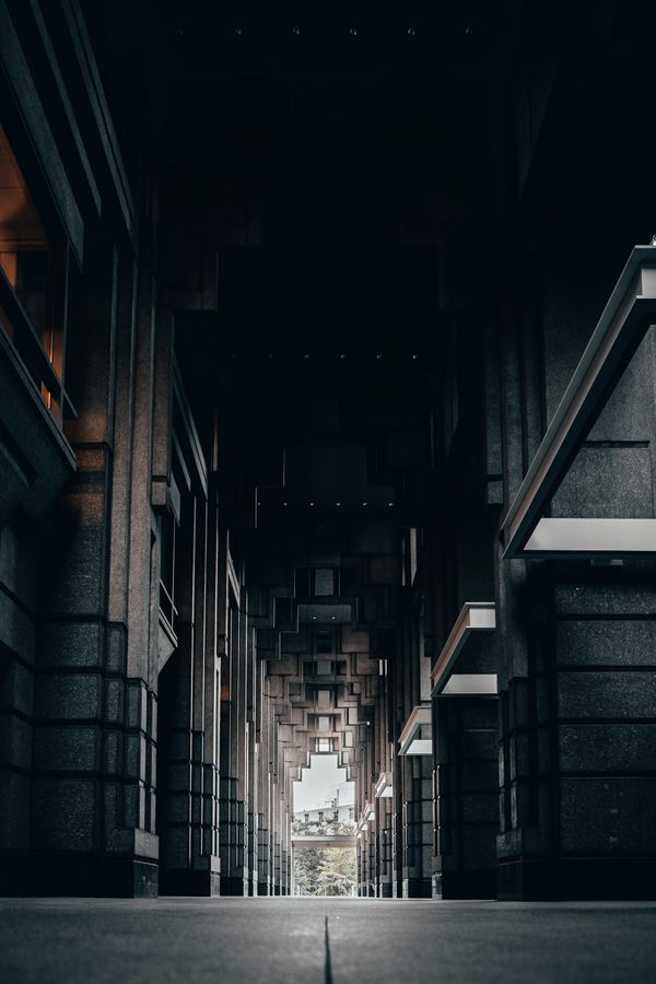
Dark Corridor
photography
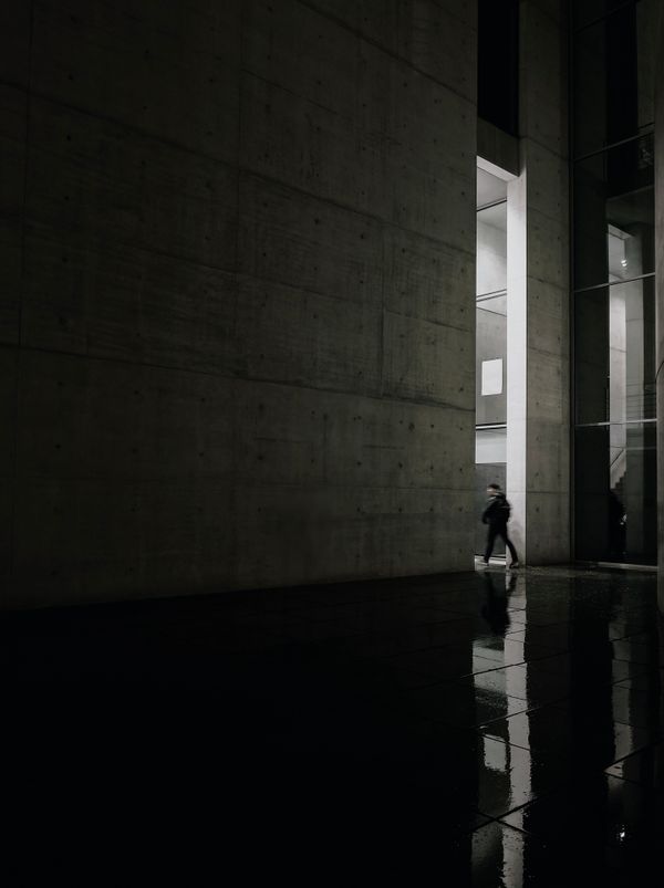
The Figure
photography
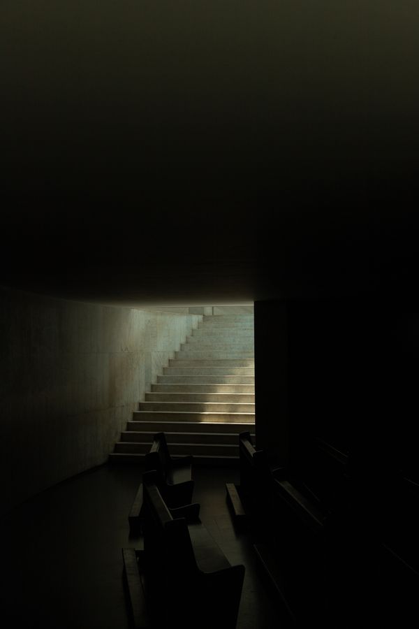
Toward the Light
photography
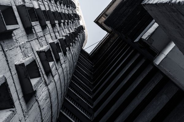
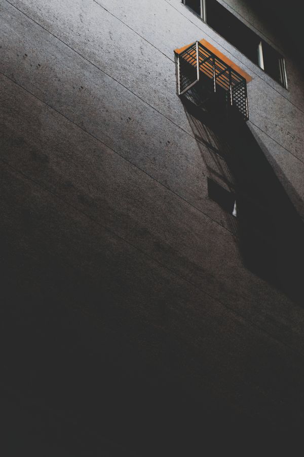
Geometric Urban
photography
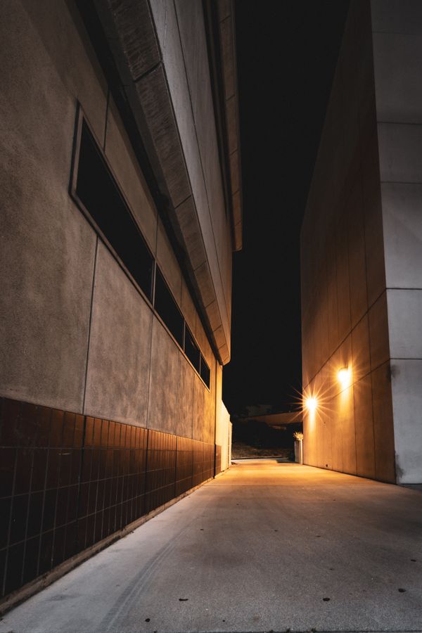
The Alley
photography
The Builder
photography
Urban Night
photography
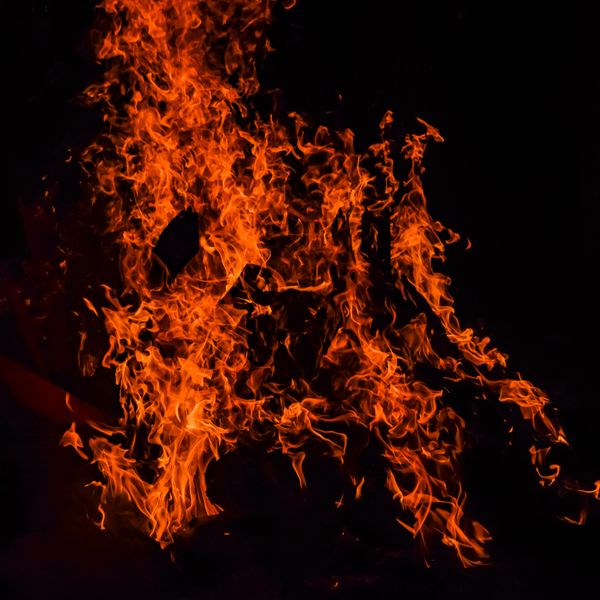
Night Fire
overall
Brand Collateral
Downloadable brand assets. Files open in a new tab.

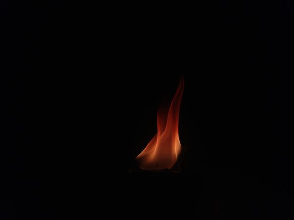
Fire Emblem Icon
This is an image of fire representative of my brand and used in the "Forged In Fire" emblem.
Open
"Forged In Fire" Emblem
This is an Emblem created to represent my brand's fire element in my fire and steel theme.
Open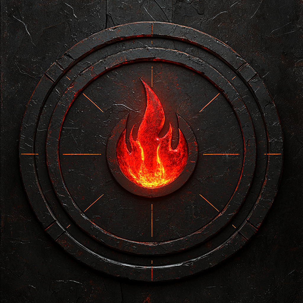
Branded FetLife Profile Photo Background
This is a branded FetLife profile photo background image, for use on the FetLife platform.
Open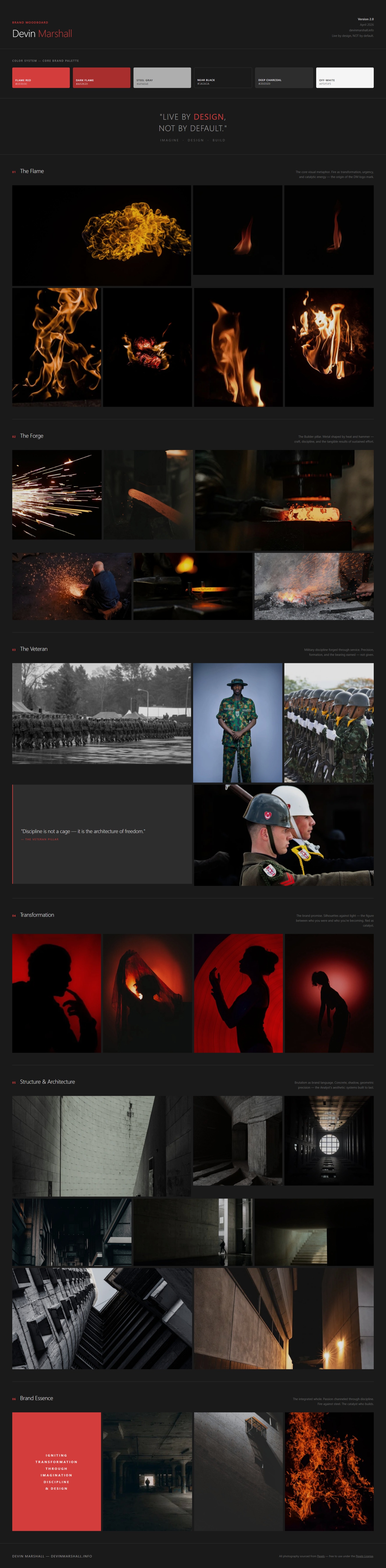

Facebook Banner Template
A design template for my Facebook profile's banner image.
Open
LinkedIn Banner Template
A design template for my LinkedIn profile's banner image.
Open
Twitter/X Banner Template
A design template for my Twitter/X profile's banner image.
Open
YouTube Banner Template
A design template for my YouTube profile's banner image.
Open
Business Card - Back Template
A design template for my business card's backsidetext placement and font usage.
Open
Business Card - Front Template
A design template for my business card's frontside text placement and font usage.
Open
Color Pallete Card
This is a color palette reference card for designers working with my brand.
Open
The Analyst Pillar Icon
"The Analyst" pillar icon used to represent the Analyst aspect of my brand in my blogs and other brand pillar related imagery.
Open
The Builder Pillar Icon
"The Builder" pillar icon used to represent the Analyst aspect of my brand in my blogs and other brand pillar related imagery.
Open
The Creator Pillar Icon
"The Creator" pillar icon used to represent the Analyst aspect of my brand in my blogs and other brand pillar related imagery.
Open
The Imagineer Pillar Icon
"The Imagineer" pillar icon used to represent the Analyst aspect of my brand in my blogs and other brand pillar related imagery.
Open
The Storyteller Pillar Icon
"The Storyteller" pillar icon used to represent the Analyst aspect of my brand in my blogs and other brand pillar related imagery.
Open
The Veteran Pillar Icon
"The Veteran" pillar icon used to represent the Analyst aspect of my brand in my blogs and other brand pillar related imagery.
Open
Letterhead Template
A template of the design structure for my newsletter's letterhead.
Open
LinkedIn Post Template
A template of the design structure for my LinkedIn post's imagery.
Open
Newsletter Header Template
A template of the design structure for my newsletter's headers.
Open
Blog OG Image Template
A template of the design structure for my blog's Open Graph images.
Open
PDF Cover Template
A template of the design structure for my PDF resources that I've created.
Open
Podcast Thumbnail Template
A template of the design structure for podcast thumbnail images that I've created.
Open
Professional Profile Image
A professional picture used for my more professional social and business profile images.
Open
Quote Card Template
A template of the design structure for quote card images that I've created.
Open
Slide Show Cover Template
A template of the design structure for presentation/slide show cover images that I've created.
Open
Story Template
A template of the design structure for story/reel images and video that I've created.
Open

Typography Specimen
This is a typography specimen reference card for designers working with my brand.
Open
Watermark Template
A template of the design structure for imagery and video's watermarks.
Open
YouTube Thumbnail Template
A template of the design structure for YouTube thumbnail images that I've created.
Open